FYP
FYP deliverables:
1) Final product
2) Team report
3) Verification form
4) Individual report
5)Symbiosis
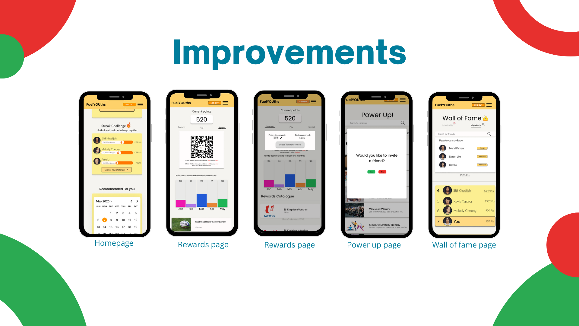
The overview of this project requires exploration of various solutions to help youths change their current mindset that staying healthy consistently is a hinderance with their future lifestyle or ambitions. Such solutions must be realistic and ultimately able to convince youths that staying healthy is complimentary to their future lifestyle.
Three key takeaways that I've personally experienced throughout this project and how it they have affected me:
1) The first takeaway was actually the first phase into the project, when my teammates and I were crafting the survey questions. We consulted with two DDUX lecturers, and both had opposing feedback on what we should be focusing on in terms of the survey questions to ask youths. I felt relieved as we weighed both opinions from our lecturers and decided to go with the feedback that was more rationalized and aligned with what we truly wanted to find out about youths.
2) The mid-June presentation. It was a great take away for me as the lecturers gave us constructive criticism on the wireframe of the FuelYOUths prototype. This criticism was meaningful as we had not thought about any flaws or faults from the prototype and also it made us go on my thinking cap on whether the prototype was suitable or not. After hearing their thorough criticism, I knew that our prototype was suitable, and we only needed to make minor refinements through further research like marketing research and user testing, to make the platform that is desirable and engaging for youths to use. This experience pushed me to think deeper about user needs and refine the solution with more purpose and clarity, making me more reflective and confident in applying feedback to improve my work.
3) The last takeaway, it would be from my supervisor Mr Damon, it was the last face to face consultation as for now, he pointed out a few of our UI flaws for example, the log in/log out page. It was best to replace the header to existing/new users, this prompt would instantaneously let users know what to tap on without much thinking. Moreover, he also pointed out that we should have done more research on the colors used within the prototype on Figma in terms of color theory. Like which colors resonated best in terms of the meaning behind it as well as with the alignment to our goals for this project. All in all, this feedback made me more attentive to design decisions that align with user expectations and project goals.
